25 Nov Designing OckyPocky – India’s favorite English learning app
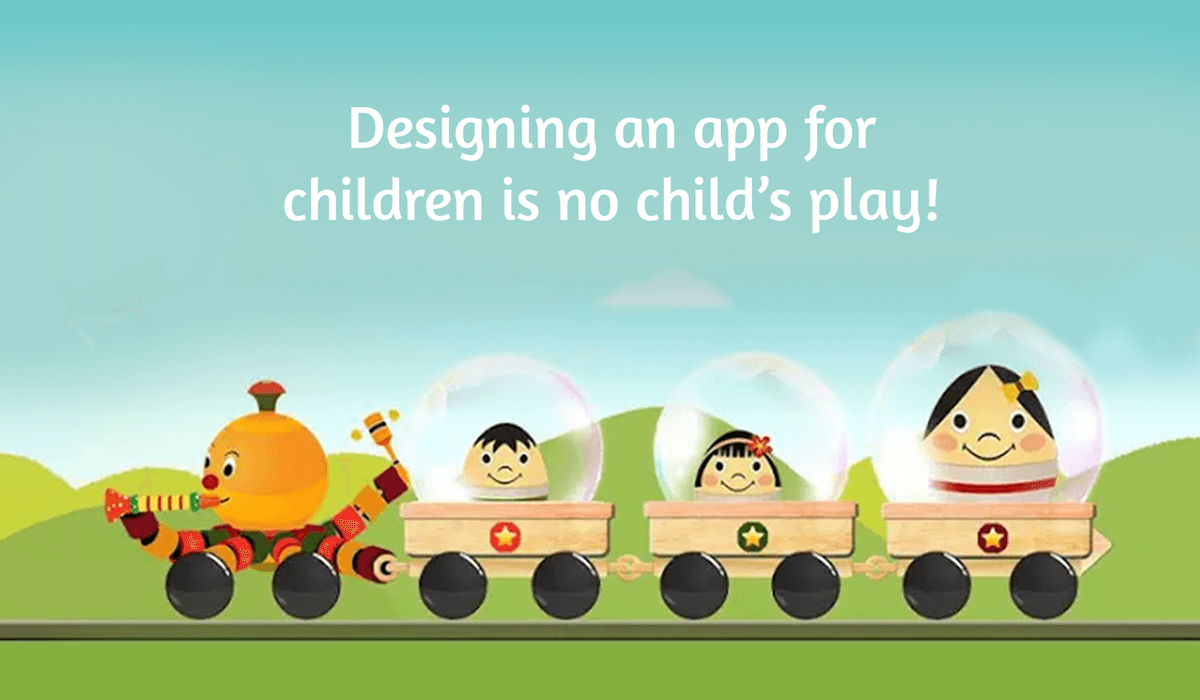
Designing an app for children is no child’s play!
Kids are the most hard-to-please users. A kids app’s interface has to cognitively, physically, and emotionally resonate with them to make it their playground instantly and intuitively!
It’s easy to lose sight of the fact that kids learn and communicate through play. – Debra Gelman (UI/UX Guru)
The co-designers of OckyPocky:
Who are we?
OckyPocky is a playful interactive English learning app designed for 2-6 year old kids. We come with easy controls that enable your little one to learn English without parental assistance, that’s the beauty of our learning environment!
The design journey:
Adults don’t see what kids see, that’s why everyone in the OckyPocky team had to shed their old skins and travel decades back to think and act like toddlers! Guided by veteran design guru Niyam Bhushan, we observed the behavioral actions of hundreds of preschool kids from Delhi-NCR and Bengaluru. We absorbed their needs, expectations and their interaction patterns with the world over months. Their fresh eyes tested our different iterations to help us become their best friend for learning. We have no plans for stopping as we are constantly evolving with feedback and great design ideas for the app, straight from their little hearts!
“Form follows Playfulness”
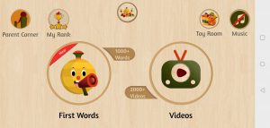
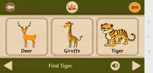
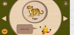
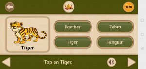
As you can see from the interface’s images above, the super-simplistic design of OckyPocky reduces the visual weight that most kids app carry. We’re speaking the child’s language and removing question marks and steps in the UI that may add to their cognitive workload.
The design and typography:
We are inspired by the 300-year-old eco-friendly Chennapatna toys and are reviving and translating the old art into the digital world.

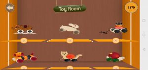
From our mascot Ockypocky to the icons, all of them are a reinterpretation of the Channapatna toys but elevated to the next level. Thus, shaping the app’s unique identity- you may notice all kid apps look alike with overbearing splashes of stereotypical kiddie colors. OckyPocky is definitely standing out from the sheep!
The theme itself radiate eco-friendliness and simplicity without complicating the app’s functionality. We’ve used Amaranth font that is reflective of Indian roots. The Amaranth family is a friendly upright italic design with a slight contrast and distinctive curves- making it very reader-friendly for the minimal text that we have written on the app.
OckyPocky talks, just like a sibling would:
We’ve reduced words and added speech to guide your little genius better in their quest to learn more. The playful voiceover adds takes the persona of an encouraging sibling. Helping kids out whenever they are making mistakes and encouraging them to be more hungry for new words.
Want your kid be confident in English?
Explore our magical playground and join 500,000+ kids now!
Android: http://bit.ly/GetOckyPocky1
Web: Ockypocky.com

No Comments